Humanize a smarthome application
MINOR MODIFICATIONS TO IMPROVE USER ADOPTION
When confronted with a business issue, my initial step is to grasp the domain, market, and user perspectives. In this particular project, the challenge arose from users finding the app too technical. They struggled to comprehend the information provided and were unsure how to enhance indoor air quality effectively.
To pinpoint the pain points and their significance, I devised metrics based on the feedback received. In this instance, the key metrics revolved around attitudes: adoption, satisfaction, and credibility. Analysis revealed a low adoption rate, making it the pivotal metric for guiding the design process. Despite this, customer satisfaction (C-SAT) was notably high, indicating that users appreciated the physical products and had successfully mastered the application.
In the following case study, I’ll guide you through my design approach. Come with me!
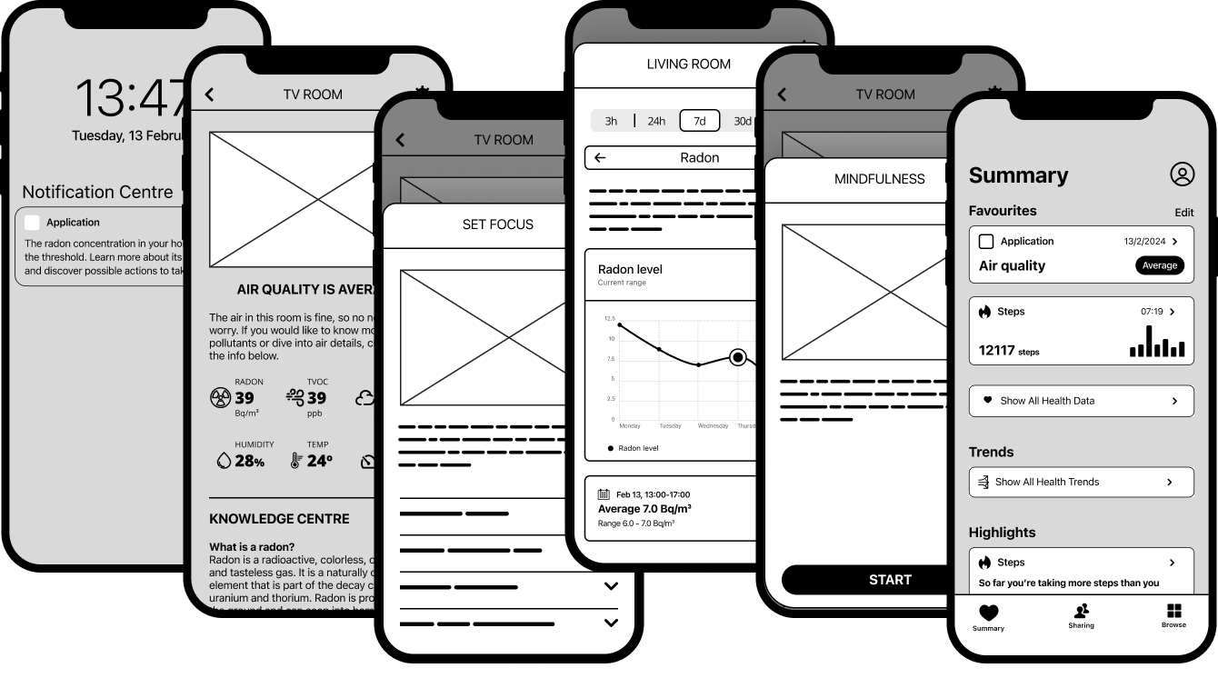
Situation: the project revolves around "humanizing an application" that is currently perceived as overly scientific. The application is used within the health and wellness industry but lacks a personal and relatable touch in its design and user experience. The goal is to transform the app from its current scientific demeanor into a more engaging and personable interface that resonates with users and aligns with the brand's focus on health and wellness.
Task: The task involves making minor changes to the application to enhance user adoption by creating a more human-centered and relatable experience. To achieve this, the primary objective is to evolve the app's visual and interactive elements to better reflect the values and identity of a health and wellness brand. This includes infusing elements that evoke a sense of warmth, empathy, and user engagement to make the app more welcoming and meaningful for its users.
Action: To address the project requirements, the first step would involve conducting a thorough assessment of the current app design and user experience to identify areas that contribute to its perceived scientific tone. Collaborating with designers and user experience experts, we would then strategize ways to introduce subtle but impactful changes that humanize the application. This could involve incorporating softer color palettes, intuitive user interfaces, relatable imagery, and personalized interactions to enhance user engagement and emotional connection with the app.
Result: By implementing the identified changes to humanize the application, the result is a transformation that resonates positively with users and reinforces the health and wellness brand's image. The evolved app now exudes a sense of personal connection and relevance, making users feel more at ease and engaged with the platform. The improved user experience leads to enhanced user adoption rates and increased user satisfaction, as individuals no longer perceive the app as overly scientific but rather as a friendly and supportive tool that aligns with their health and wellness goals.
The process
When tackling a challenge, I follow a solid process: understanding the problem and its context, conducting thorough research on competitors, users, and the market, and then deciding on the best approach or considering alternative directions based on the requirements.
Brainstorming & ideation
For the current problem - namely, that the app is too scientific - I came up with a few ideas.


Conclusions
All problems should start with understanding the user.
Clear, non-intrusive communication, proper tone of voice and transparency will be a good start to provide solutions for pain points and lack of features.
Involving users comes with benefits such as data, direct feedback and engagement.
Education is key!
Collaboration is a must across the company and together with the users.
Personalization might matter.
The design process
The process involves following each step diligently to achieve optimal results. However, there are instances where shortcuts may be necessary, such as when facing tight deadlines or possessing prior domain knowledge or research findings. The crucial aspect, in my perspective, is to validate the solution, engage stakeholders, and identify potential feasibility or logic issues.
Research: Understanding the domain, market, users, and competitors thoroughly is essential for informed decision-making. Involving stakeholders early on can provide valuable insights when finalizing suggestions.
Flowchart and user journey mapping: Utilizing a user journey or a simple flowchart can help identify logical gaps and analyze the entire flow of the design process. These visual aids are useful for project documentation and communication with developers.
Low fidelity wireframes: Creating quick iterations helps in visualizing and refining design suggestions across various platforms. Prototyping at this stage aids stakeholders in grasping the complete flow of the design. This phase is crucial as it streamlines the idea before moving forward.
High fidelity mockups: Building detailed mockups, although slower, proves efficient with a design system in place. By using or establishing a design system, stakeholders can better envision the final product, benefiting both design understanding and marketing strategies.
Prototyping: Validation through prototyping is vital, especially for complex cross-platform products. Team members can test feasibility, identify errors, and assess edge cases. Prototypes uncover glitches, enhance user efficiency, and significantly impact customer experience.
Documentation, handover, and design reviews: The designer officially concludes the project at this stage. It is crucial for developers to review progress and address potential bugs before testing, saving time in the process.
Release and post-release follow-up: Designers are responsible for monitoring the release and conducting post-release user interviews. Evaluating whether the feature meets user needs and gathering feedback for future versions are key steps in this phase.