Case studies
Design Systems — from one designer's system to an agentic one
At a glance
Three years of the same design system evolving with the team and the technology around it: built alone from scratch in 2024, scaled into a shared practice as more designers joined, used to harmonize two diverging front-end libraries, and now being extended to work for AI agents as well as people.
The challenge
When I joined Element Logic in 2024, there was no design system — every screen was built from scratch, and two engineering stacks, MudBlazor and React, were already quietly drifting apart with nothing shared to pull them back together. Warehouse management software doesn't leave much room for ambiguity: dense data, many user roles, workflows that have to hold up under real operational pressure. Whatever I built would need to carry that weight alone, before there was anyone else to help maintain it.
My approach
- Built the design system from the ground up, solo — tokens, components, documentation — establishing one source of truth before there was anyone else around to diverge from it.
- As more UX designers joined the team, turned a personal system into a shared practice: how the team would contribute to and govern it together, not just work around it individually.
- Worked closely with engineering to reconcile the MudBlazor and React libraries into a single shared standard, rather than forcing either team onto the other's stack.
- Kept adoption collaborative rather than mandated — an ongoing loop with engineers on what was realistically buildable, adjusting the system rather than dictating to it.
- With the arrival of Claude Design and agentic tooling, began extending the same system into the agentic era: the system's rules now need to be legible to AI agents generating and assembling components, not only to the designers and engineers who built it.
The impact
The outcome
What started as one person's system is now a team's shared discipline — and the same principle is now being applied one level further: building a design system that agents, not just people, can work within.
VCC:Live — redesigning the operator's cockpit
~20% faster average call handling, agent ramp-up cut from 3 weeks to 2, and the product's first design system — built outward from this view.
The challenge
Call center agents worked from one screen while live on a call: the script they had to follow, the customer's history and details, and the call controls itself. That screen had grown into a patchwork — script, customer data, and controls competed for space and attention, forcing agents to hunt across tabs mid-call. Under call pressure, that cost time and caused mistakes. There was also no shared design system yet, so every new feature added its own visual logic.
My approach
- Mapped the whole product before touching one screen. Every feature idea went onto a board with no filter, then got grouped into themes, then sorted into what belonged in the MVP versus the backlog. The call-handling view — the cockpit — earned its place in the MVP on its own merits, which is what justified rebuilding it properly instead of patching the existing layout.
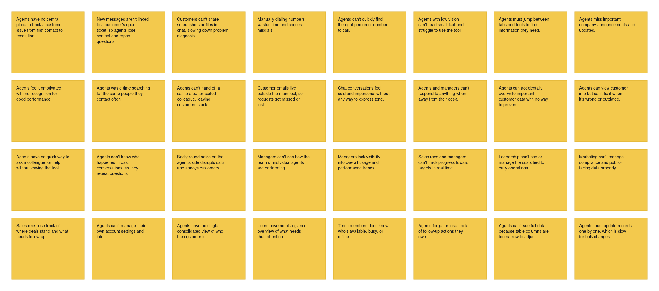
Figure 1. User problems mapped out
- Watched real calls. I shadowed operators to see, in the moment, what information they reached for and when — not what the org chart assumed they needed.
- Separated always-visible from on-demand. Mapped which information had to be permanently in view during a call and what could be pulled up only when needed.
- Mapped assumptions and ideated. Wrote down what we were assuming about agents' needs, then ran fast ideation rounds to turn those assumptions into concrete directions worth testing.
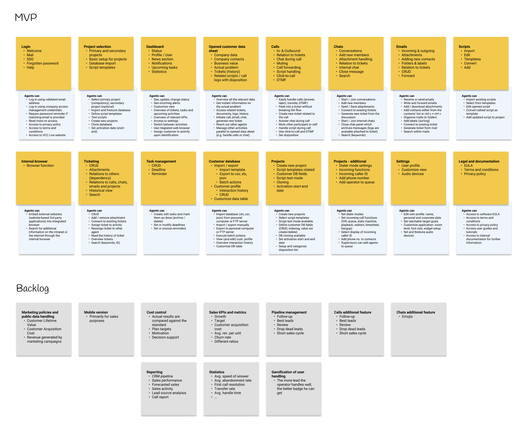
Figure 2. How I worked with data
- Rebuilt the layout into fixed zones. Script, live customer context, and call controls each got a predictable, dedicated zone instead of competing for the same space.
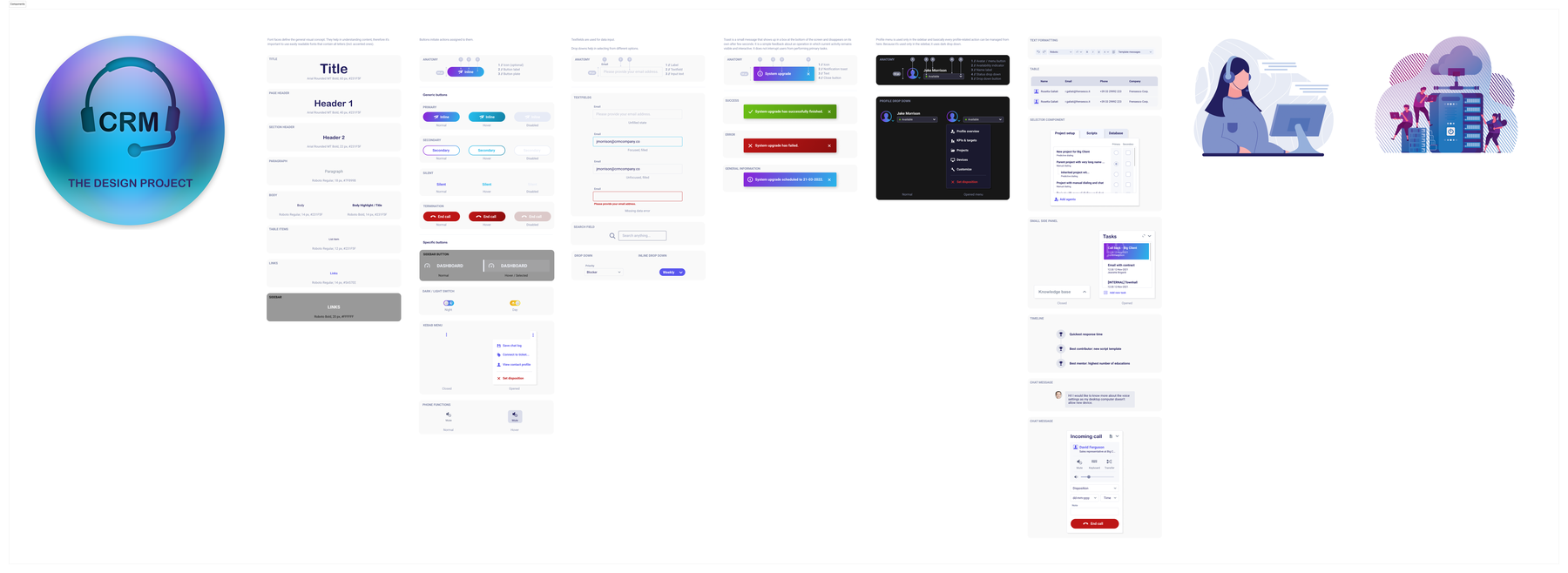
- Built the design system this view needed. Established the components and patterns as reusable foundations, not one-off fixes — the first real design system for the product.
- Rolled it out with a design team I was building from scratch, using the new structure as the reference point for every feature that followed.
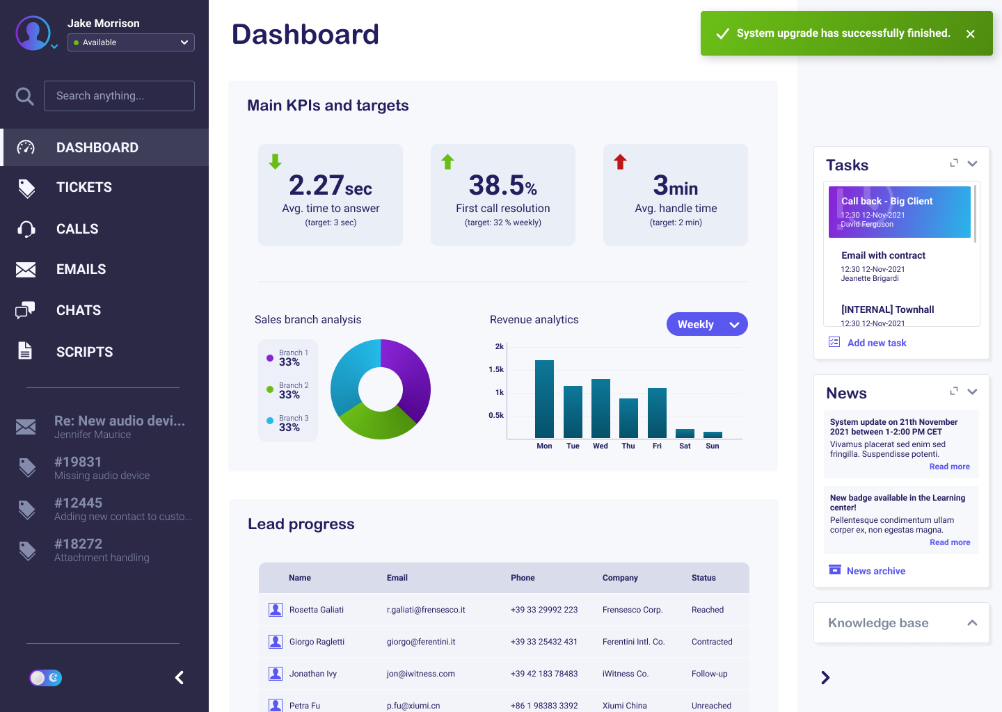
The impact
The outcome
Agents handled calls with far fewer context switches, new agents onboarded faster, and the design system it produced became the foundation the rest of the product was built on afterward.
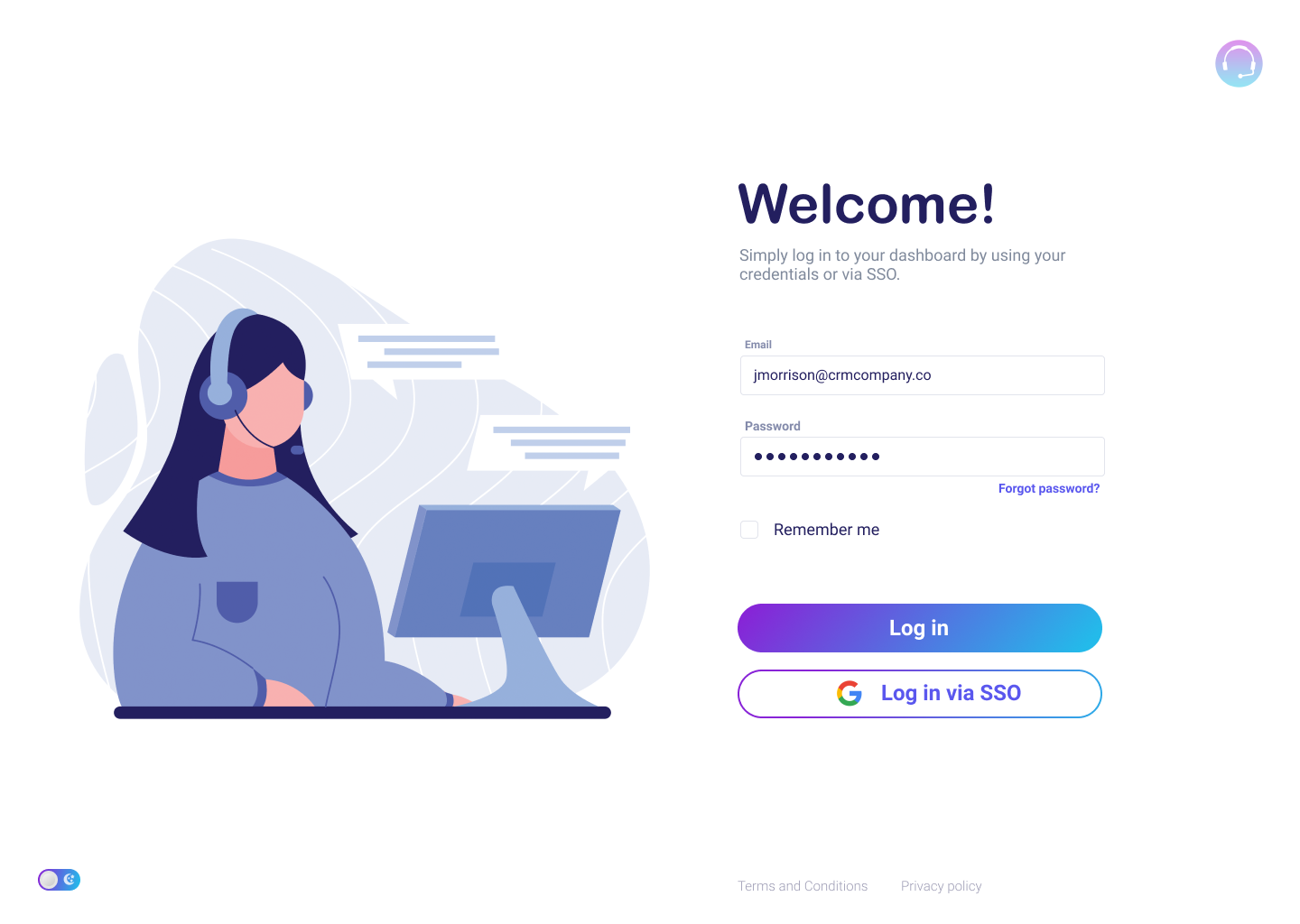
A note on the visuals: the screens shown below reflect the user flow and interaction design from my work on this project. The visual UI and design system in the live software have moved on since and no longer match these screens as of now.
Futurehome — mapping a logical structure out of feature sprawl
Navigation cut from 12 sections to 5, ~35% fewer "where do I find X" support tickets, and today's energy consumption down to a single tap.
The challenge
Futurehome's mobile app manages a household's energy: live consumption, connected devices, multiple energy sources, automations, a cost calculator, gamified savings challenges, and account settings. Every one of those had shipped as its own feature, dropped into the navigation wherever it fit at the time. There was no shared logic holding it together — so the app grew genuinely complicated: people (and new teammates) couldn't predict where anything lived, and every new feature made the structure a little worse. It needed a real information architecture, built from research rather than bolted on after the fact.
My approach
- Started from research, not the existing menu. Built personas, mapped the relevant consumption and energy behaviors, and inventoried every feature and screen already shipped — so the new structure was grounded in how people actually think about their energy, not in how the backlog had accumulated.
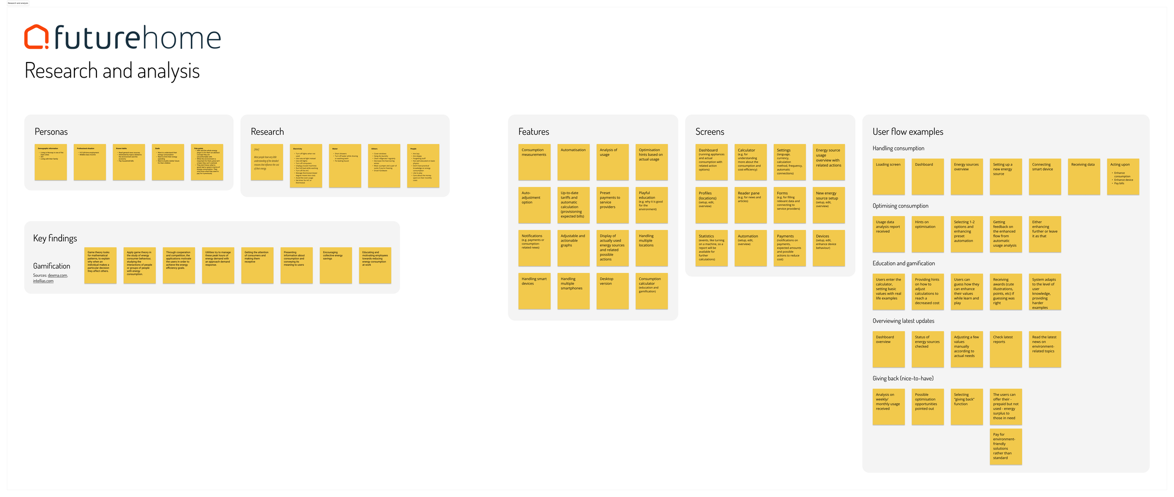
Figure 1. Research and analysis — personas, findings, and a full feature inventory
- Grouped features by what they were for. Instead of one long, flat list of everything the app could do, I clustered features into a small number of logical jobs: keeping track of consumption, controlling and automating devices, understanding cost, and managing the account.
- Rebuilt the screen hierarchy from the ground up. Turned that grouping into a real sitemap — five clear top-level sections instead of a sprawling, inconsistent menu — with every sub-screen given one obvious place to live.
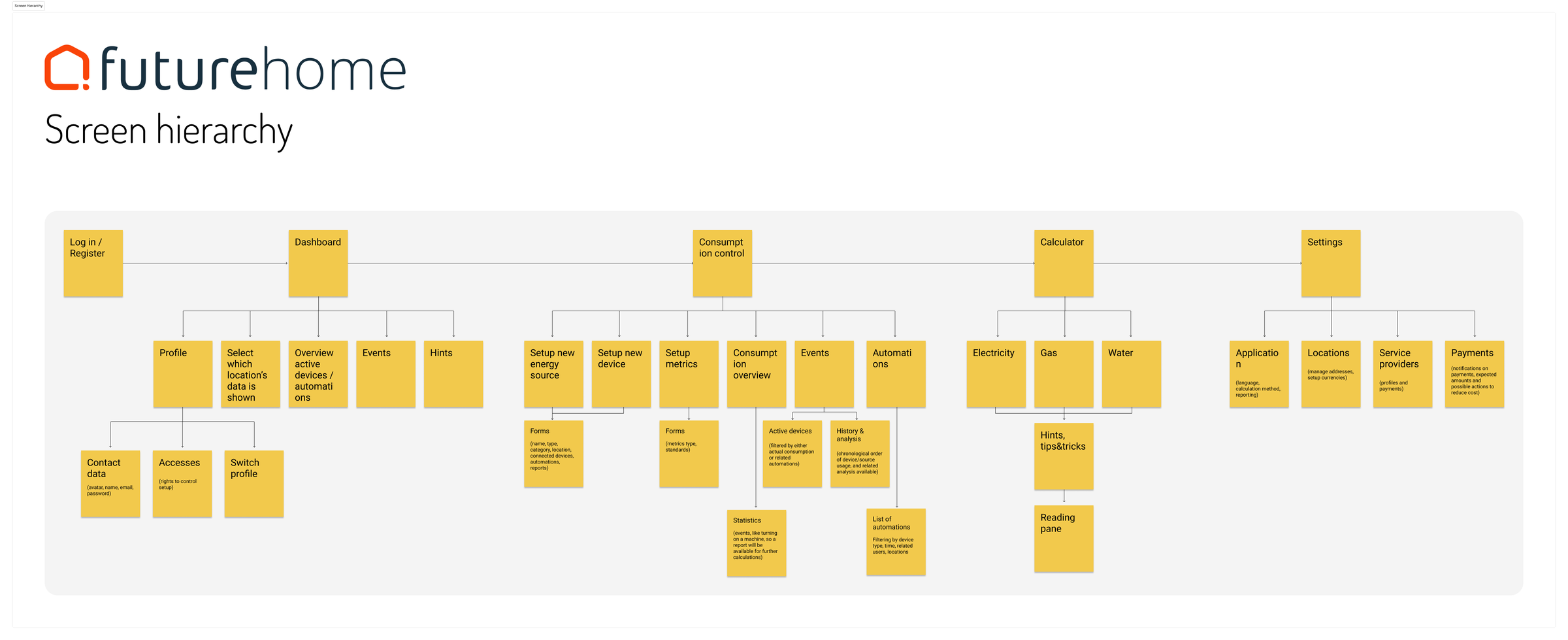
Figure 2. The rebuilt screen hierarchy — five logical sections, replacing an unpredictable structure
- Prototyped every screen against the new structure. Wireframed the full flow — login through dashboard, consumption, events, automations, calculator, and settings — to pressure-test whether the new hierarchy actually held up screen by screen, not just as a diagram.
- Documented the structure for engineering. Annotated flows and screen specs so the team could build against the new architecture confidently, and so it stayed consistent as new features were added after handoff.
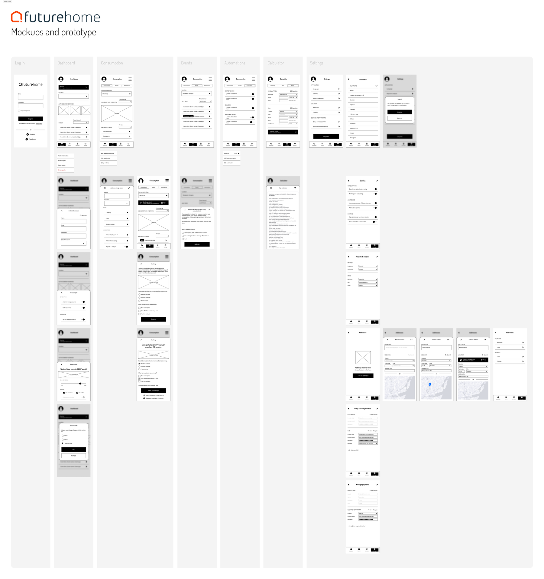
Figure 3. Mockups and prototype — every screen built against the new structure
The impact
The outcome
A navigation model grounded in real research instead of accumulated feature decisions — one people could predict, new teammates could learn quickly, and engineering could build against with a documented structure that kept holding up as new features were added after I handed it off.
Airthings — from "scientific" to human
A concept redesign — persona-grounded principles, a friendlier onboarding, and a repeatable design process — built for a recruitment exercise and not yet validated with real users.
The challenge
Airthings' radon-monitoring app looks and feels "scientific." The task: evolve it into something more personal and relevant — an experience that fits a health and wellness brand. You can't humanise a product without the people using it, and Airthings already has an engaged user base that gives feedback — so my approach was to listen first, then design. Not redecorating a scientific app, but reframing what it's for: helping people feel good about their home's air.
My approach
- Reframed around how people feel, not just the data. Instead of leading with sensor readings, I grounded the redesign in how people feel about the air they breathe — the readings become supporting evidence, not the headline.
- Grounded it in six real personas, not assumptions. Mapped six user types — a tech-savvy homeowner, a health-conscious parent, an eco-friendly enthusiast, a busy professional, a budget-conscious renter, and a senior with health concerns. Each cares about air quality for a different reason: control, family health, sustainability, convenience, budget, safety. This kept the redesign grounded in real motivations instead of assumptions, and made feature priorities easy to defend.
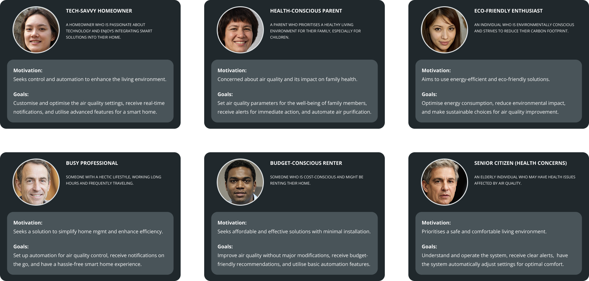
Figure 1. The six personas driving the redesign
- Set a design direction from four principles.
- Lead with the brand, not the science. Airthings is already calm, modern and stylish — I leaned into that with a consistent design system, soft imagery and inclusive visuals.
- Make the science digestible. Turn raw readings into plain-language insight, so users grasp what radon or CO₂ means for them without a chemistry lesson.
- Talk like a human. Empathetic, actionable notifications ("here's what this means for you") instead of clinical alerts.
- Support the whole wellness journey. Personal dashboards, goals, progress over time, and gentle wellness touches like guided breathing.
- Rebuilt onboarding to invite exploration before commitment. The onboarding welcomes users, explains key terms in friendly language, and lets them explore the app before connecting a device — positive tone, simple illustrations, no information overload.
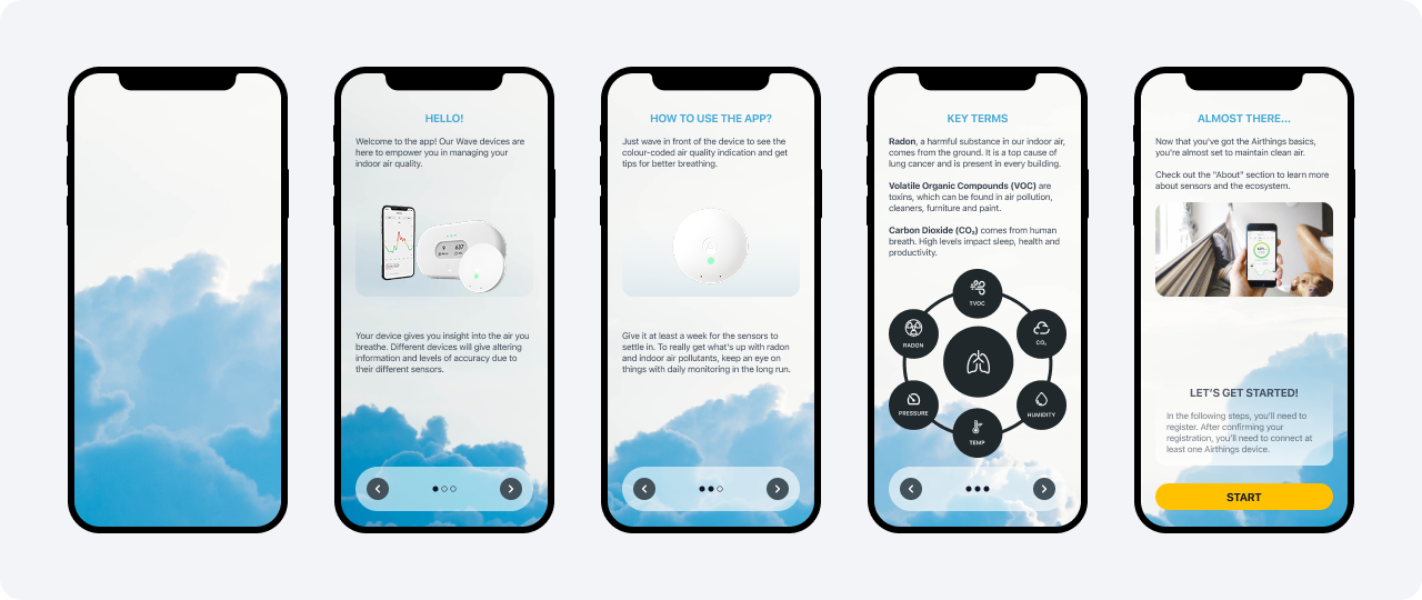
Figure 2. Onboarding — explore before connecting a device
- Rebuilt the everyday experience around wellbeing, not raw data. Room-level air quality at a glance, a knowledge centre for the curious, clear trends over time, and a personal summary that treats air quality as part of overall wellbeing.
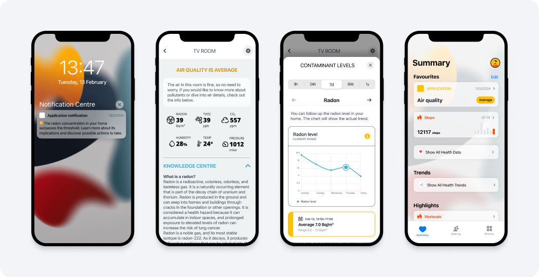
Figure 3. Everyday screens — room air quality, trends, and a personal summary
- Sketched cheaply before committing to high-fidelity screens. Quick hand sketches to explore layouts and ideas before committing to high-fidelity design.
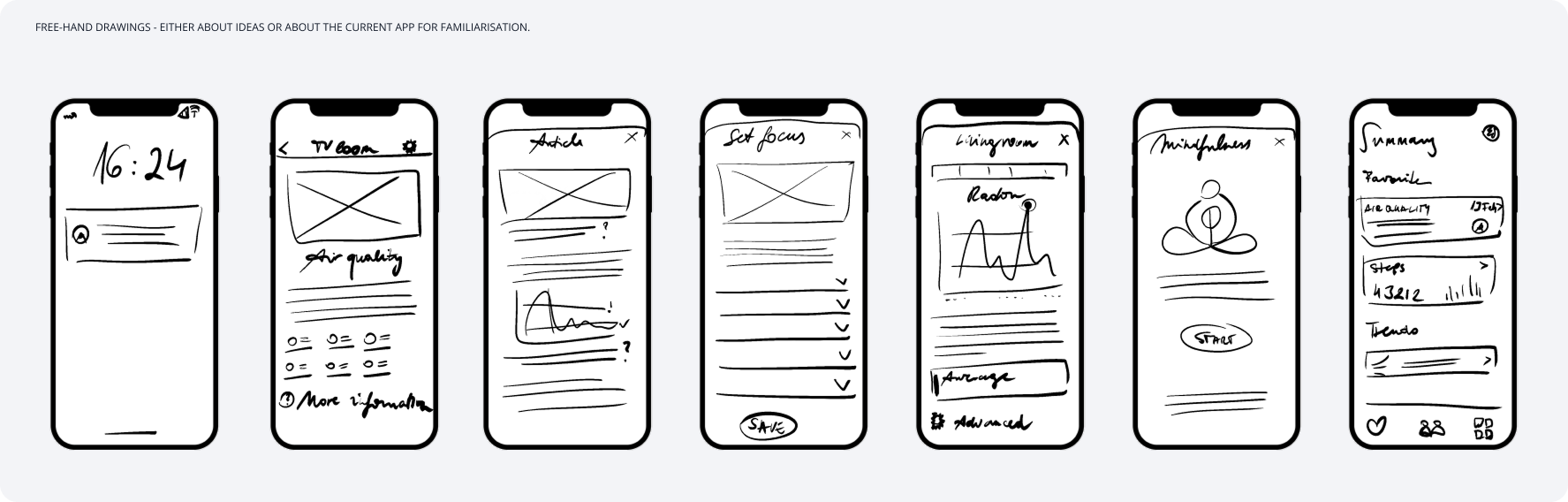
Figure 4. Free-hand sketches — exploring ideas and the current app before committing to high-fidelity design
- Framed the redesign as a repeatable process, not a one-off. From business requirement and user research, through iteration, low- and high-fidelity design, collaboration, testing and post-release follow-up — a loop, not a single pass.

Figure 5. The design process as a repeatable loop
The impact
This was concept work for a recruitment exercise, not a shipped product, so there's no production impact to report. Ideas like gamification, badges, and community testimonials could deepen engagement, but I flagged them as hypotheses to test with real users rather than features to ship on assumption — knowing what not to ship yet is part of the job.
The outcome
A reframed product direction grounded in six real personas, a friendlier onboarding, an everyday experience built around wellbeing rather than raw sensor data, and a repeatable design process — moving Airthings from feeling "scientific" to feeling personal.